
How Painting Choices Affect Home Mood and Ambiance
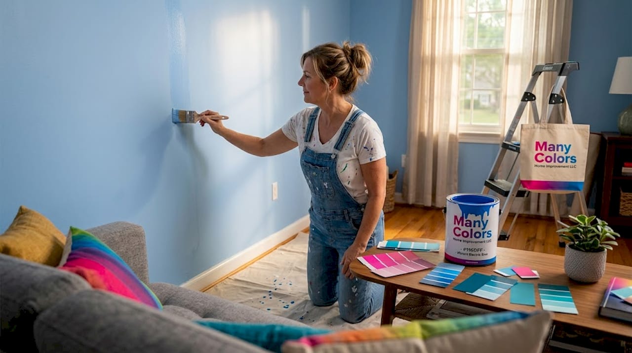
The walls of your home are doing more than you think. Understanding how painting choices affect home mood is one of the most underused tools in interior design, yet it shapes how you feel every single morning you wake up and every evening you wind down. The colors surrounding you influence your stress levels, your energy, your focus, and even how warm or cold a room feels. Most people pick paint based on a quick gut reaction at the hardware store. This article gives you something better: a room-by-room framework grounded in color psychology and real design practice.
Table of Contents
Key takeaways
Point | Details |
Color affects more than looks | Paint colors directly influence emotions, stress levels, and even perceived room temperature. |
Match color to room function | Warm tones energize social spaces; cool tones calm bedrooms and private areas. |
Light changes everything | Natural and artificial lighting shift how paint colors appear and feel throughout the day. |
Avoid the 10-minute mistake | Most homeowners rush color choices and regret them. Test samples first, always. |
Neutral palettes boost home value | Soft whites and warm neutrals improve buyer comfort and can increase resale returns significantly. |
How painting choices affect home mood: the science behind color
Color is not just decoration. It is an atmospheric force shaping how a room feels the moment you walk into it. To use it well, you need to understand the two major categories: warm tones and cool tones.
Warm colors include reds, oranges, yellows, and earthy terracottas. These shades stimulate the nervous system. Research confirms that warm colors increase heart rate and physiological arousal, which is why a red dining room feels exciting and a golden-yellow kitchen feels alive. Warm tones also create the perception of closeness and coziness, making large, empty rooms feel more intimate.
Cool colors work in the opposite direction. Blues, greens, and soft purples reduce physiological arousal and lower perceived stress. Blue interiors rank highest for mood and cognitive performance, which explains why so many people gravitate toward blue-gray tones in bedrooms and home offices.
Neutral colors are often underestimated. Warm greiges, soft taupes, and muted creams act as mood stabilizers. They do not overwhelm the senses, but they are not sterile either. Think of them as the foundation that lets your furniture, lighting, and accent colors do their work without competing.
One thing most people miss entirely: saturation matters as much as hue. A bright, highly saturated cobalt blue can feel just as stimulating as a warm red. Softer, muted tones reduce anxiety and improve comfort far better than their vivid counterparts. So when you are choosing between two blues, the quieter one usually wins for long-term livability.
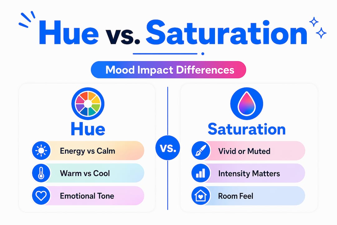
Pro Tip: Before committing to a color, ask yourself whether the room needs energy or calm. That single question will eliminate 80% of bad paint choices before you ever open a can.
Room-by-room color guide for mood and function
The most practical application of color psychology in home design is matching each room’s palette to its purpose. A color that works beautifully in a kitchen can quietly sabotage a bedroom.
Bedrooms
The bedroom is your recovery space. Soft blues, muted greens, and warm neutrals promote relaxation and better sleep, while bright reds and yellows increase anxiety in bedrooms. If you want a dramatic look, go for deep, dusty tones like slate blue or sage rather than saturated jewel tones that keep your brain alert.
Living rooms
Living rooms need to balance comfort with social energy. Warm taupes, soft terracottas, and muted greens all work well here. Avoid anything too cool and stark. A living room painted in a cold, bright white can feel clinical rather than welcoming.
Kitchens and dining rooms
Warm colors energize social and dining spaces, which is why yellows, warm oranges, and creamy whites are classic kitchen choices. They stimulate appetite and conversation. Deep, moody tones like forest green or navy can also work in dining rooms, creating an intimate, restaurant-like atmosphere.
Home offices
For focus and creativity, blues and soft greens are your best allies. Red and orange performed worst in studies measuring cognitive function and emotional state. If you want to add warmth without losing focus, a warm gray or soft sage hits the right balance.
Bathrooms
Bathrooms benefit from palettes that feel clean and restorative. Soft whites, pale aquas, and light stone tones create a spa-like quality. Avoid very dark colors in small bathrooms without windows, as they can make an already tight space feel oppressive.
Here is a quick reference for matching color to room function:
Room | Recommended tones | Tones to avoid |
Bedroom | Soft blue, sage, warm gray | Bright red, saturated yellow |
Living room | Warm taupe, muted terracotta | Cold bright white, stark gray |
Kitchen | Warm yellow, creamy white | Dark, heavy tones in small kitchens |
Home office | Soft blue, muted green | Red, bright orange |
Bathroom | Pale aqua, light stone, soft white | Very dark tones in windowless spaces |
How light and materials shape color perception
Choosing the right color is only half the work. How that color behaves in your specific space depends heavily on light and the materials around it.
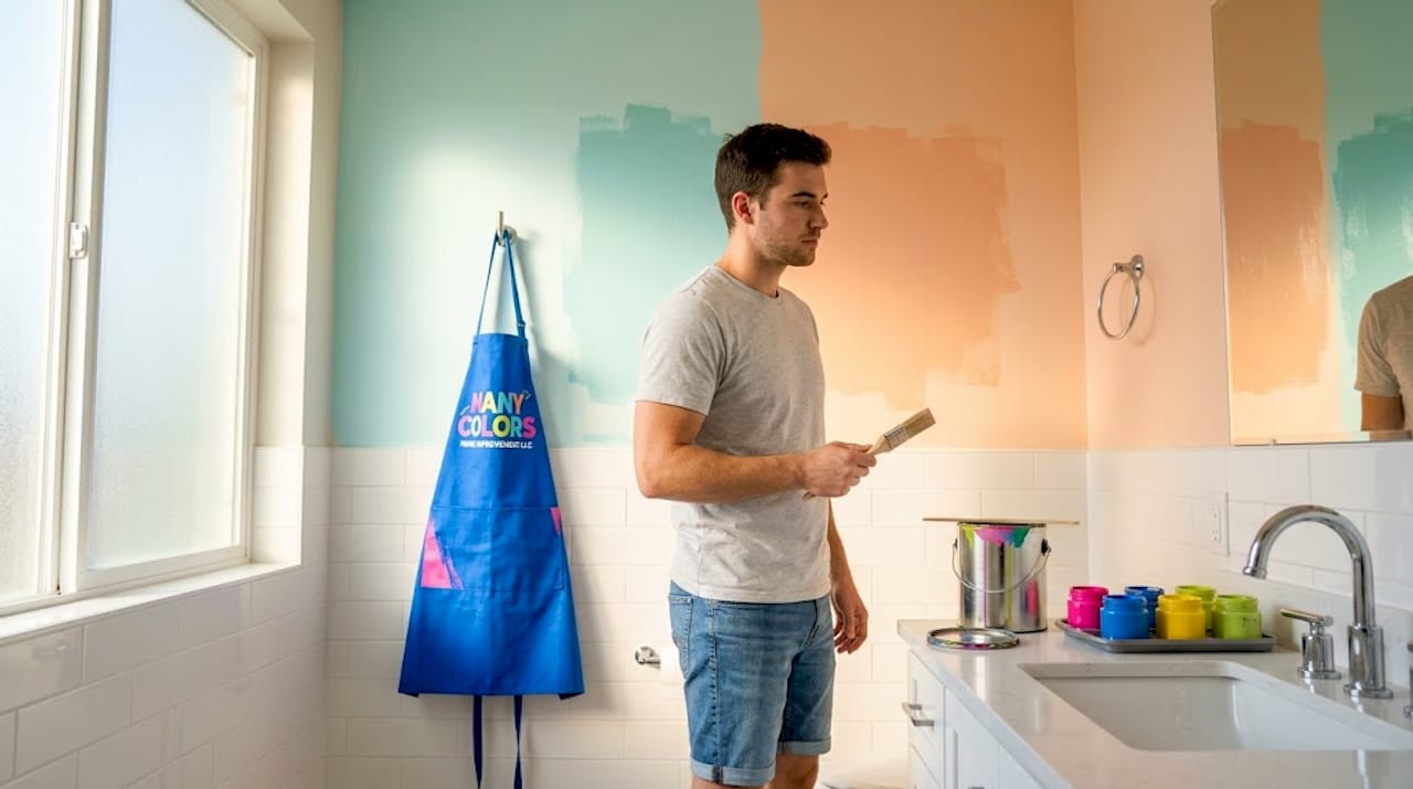
Natural and artificial light drastically affect how paint colors are perceived throughout the day. A warm beige that looks inviting in afternoon sunlight can turn muddy and dull under fluorescent lighting at night. North-facing rooms receive cooler, bluer light, which makes warm tones look more balanced but can make cool tones feel cold. South-facing rooms get warmer, golden light that makes almost any color glow.
Artificial lighting compounds this effect. Warm-toned bulbs (2700K to 3000K) soften cool colors and make warm ones even richer. Cooler LED bulbs above 4000K can strip warmth from a room and make colors feel sterile or harsh. If you are painting a room you use primarily at night, test your color samples under the actual bulbs you use. The difference can be dramatic.
Paint finish is another variable that most homeowners overlook entirely. Matte and eggshell finishes absorb light and make rooms feel softer and more relaxed. Gloss finishes reflect light and can make colors feel more vibrant, but they also amplify imperfections and can feel harsh in larger doses. For living areas and bedrooms, eggshell is usually the right call. Save gloss for trim, doors, and high-traffic surfaces.
Materials tie everything together. Warm wood tones pull warmth out of neutral walls and make them feel richer. Stone and concrete cool a room down. Soft textiles like linen curtains and wool rugs add psychological warmth regardless of wall color. When you treat your wall color as one layer in a system rather than the whole picture, the results feel far more intentional and livable. You can find practical guidance on durable painting techniques that complement these material choices.
Pro Tip: Always test paint samples on the actual wall, not just a small chip card. Paint a 12-by-12-inch square and observe it at multiple times of day before committing.
Common mistakes and how to avoid them
Most people rush color decisions in ways that cost them time and money. Homeowners spend fewer than 10 minutes choosing paint color on average, which is why color regret is so widespread. Here is how professionals approach it differently.
Build a whole-home palette first. Designers recommend a palette of 3 to 5 recurring colors across the home to create visual flow and emotional continuity. When colors shift dramatically from room to room, the home feels disjointed and subtly stressful.
Use the 60-30-10 rule. Sixty percent of a room should be a dominant color (usually walls and large furniture), 30 percent a secondary color (upholstery, rugs, curtains), and 10 percent an accent (pillows, art, accessories). This ratio creates balance without monotony.
Avoid highly saturated colors in rooms where you spend long hours. A bold, saturated orange accent wall looks exciting in a photo. After six months of living with it, it becomes exhausting. Deep, muted earth tones offer lasting psychological comfort that highly saturated colors rarely deliver.
Test before you commit. Digital tools and paint sample cards are not enough. Buy small sample pots and paint actual sections of your wall. Live with them for at least 48 hours across different lighting conditions.
Think about transitions. The color you see when you walk from one room into another matters. Abrupt shifts from warm to cold palettes create a jarring psychological effect. Keeping undertones consistent across adjacent rooms smooths that transition.
Pro Tip: When in doubt, go one shade lighter than you think you need. Colors almost always read darker on a full wall than they do on a sample card.
Paint color choices and home resale value
The impact of paint colors extends beyond how you feel at home. It directly affects what buyers feel when they walk through your door, and that translates to real dollars.
Eighty-five percent of designers favor soft or warm whites for resale value, and interior painting can increase home value by up to 107% of the painting cost. That is one of the best returns on investment in home improvement. The reason is psychological: neutral palettes make spaces feel larger, cleaner, and easier for buyers to imagine as their own.
Specific colors carry measurable financial weight. Navy blue bedrooms add an average of $1,815 to resale price according to Zillow data. Soft, warm whites in kitchens and bathrooms consistently outperform bolder choices in buyer surveys. The pattern is clear: colors that create psychological comfort and perceived spaciousness win in the market.
Color harmony across the home also signals quality. A home where colors flow logically from room to room reads as well-designed and well-maintained, even if the actual renovation work is modest. Pairing thoughtful color choices with interior repairs before selling creates a compounding effect on buyer perception that neither approach achieves alone.
Color approach | Buyer perception | Resale impact |
Soft warm whites | Spacious, clean, move-in ready | High positive |
Warm neutrals | Welcoming, quality craftsmanship | Moderate to high positive |
Bold saturated colors | Polarizing, personalized | Neutral to negative |
Dark tones without balance | Heavy, smaller feeling | Negative in most markets |
My take on color and what most people get wrong
I have walked through hundreds of homes at every stage of renovation, and I will tell you something that most design articles will not: the biggest color mistakes are not about picking the wrong shade. They are about impatience and overthinking at the same time.
People either grab a color because it looked great in a magazine and slap it on without considering their light, their furniture, or their lifestyle. Or they get so paralyzed by options that they default to the safest possible beige and wonder why the room still feels flat. Neither approach serves you.
What I have learned over years of working on residential spaces is that the homes that feel genuinely good to be in almost always share one quality: their colors were chosen in layers. Not one bold statement wall, but a palette where the walls, trim, ceiling, and materials are all in quiet conversation with each other. Layering multiple earthy shades creates a richness and emotional depth that a single color, no matter how beautiful, cannot replicate on its own.
I also think people underestimate how much their own lifestyle should drive color choices. If you work from home and need your space to feel calm and focused, that overrides any trend. If you have a family that gathers loudly and joyfully in the kitchen every night, lean into the warmth. Color should serve your actual life, not a Pinterest board.
The other thing worth saying plainly: getting this right is worth the time. A good paint job in the right colors is one of the most cost-effective ways to change how your home feels. You can learn more about cause-aligned home renovation and how thoughtful choices compound into something meaningful.
— Ricco
Ready to put color psychology to work in your home?

At Manycolorswi, we do not just paint walls. We understand how color choices shape the way a home feels to live in, and we bring that knowledge to every project. Whether you are refreshing a single room or repainting an entire home before listing it, our team helps you select shades that match your space, your light, and your life. We use premium paint products that hold their tone over time and complement the materials already in your home. And because every project we take on supports our mission of training and employing people who deserve a second chance, your home improvement investment carries real human impact. Explore our professional painting services and take the first step toward a home that genuinely feels the way you want it to.
FAQ
What colors are best for a relaxing bedroom?
Soft blues, muted greens, and warm neutrals are the best paint colors for relaxation in a bedroom. Avoid bright reds and saturated yellows, which increase alertness and can disrupt sleep.
How do warm vs cool paint tones affect a room differently?
Warm tones like red, orange, and yellow increase energy and make spaces feel cozier, while cool tones like blue and green reduce stress and create a calming, spacious feeling.
Does paint finish affect the mood of a room?
Yes. Matte and eggshell finishes absorb light and create a softer, more relaxed atmosphere, while gloss finishes reflect light and can make a room feel more stimulating or harsh.
How many colors should I use across my whole home?
Designers recommend a whole-home palette of 3 to 5 colors to create visual flow and emotional continuity from room to room.
Can paint color choices actually increase home resale value?
Yes. Soft and warm whites are favored by 85% of designers for resale appeal, and strategic interior painting can return up to 107% of its cost in added home value.
Recommended
Comments